In-Theater Intelligence? There's An App For That
U.S Army Soldier Equipment To Be Modernized With iPhone and Android Smartphones
With the ever reducing cost and ever increasing capability and durability of smartphone technology, U.S. Army troops could find themselves armed with an iPhone as soon as February 2011, according to a report in USA Today.
The report states that at part of its Connecting Soldiers to Digital Applications (CSDA) program, the U.S Army is working on a soldier technology solution that would mean an iPhone or Android-based smartphone as a standard piece of equipment for every soldier - including picking up the tab on the monthly bill.
"One of the options potentially is to make it a piece of equipment in a soldier's clothing bag," Lt. Gen. Michael Vane, Director of the Army Capabilities Integration Center (ARCIC) told USA Today, adding that most soldiers think this soldier modernization plan is too good to be true.
Mike McCarthy, director of the mission command complex of Future Force Integration Directorate at Fort Bliss, disagrees. McCarthy told USA Today about his vision for a digitally connected army from the ground up.
"What we're doing is fundamentally changing how soldiers access knowledge, information, training content and operational data," McCarthy said. "The day you sign on to be a soldier, you will be accessing information and knowledge in garrison and in an operational environment in a seamless manner. We're using smartphone technologies to lead this."
But it isn't only smartphones. McCarthy explained to USA Today that they were looking at everything from iPads, Kindles, and Nooks, to mini-projectors. Fortunately, the U.S. Army is planning on keeping its options open instead of signing any kind of exclusivity agreement, Rickey Smith, Director of ARCIC-Forward, told USA Today.
"We're not wedded to a specific piece of hardware. We are open to using Palm Trios, the Android, iPhone or whatever else is out there."
The Army plans to begin issuing phones, network equipment and applications to the first Army brigade to be modernized under the brigade combat team modernization program in February. That test will not be limited to smart phones but will include any electronic devices that may be useful to troops.
Realising both the cost and time saving benefits of using 'tried-and-tested' technology, much like its utilization of XBox 360 controllers, the U.S. Army also states it has no plans to develop its own devices, instead opting to make minor tweaks and making the equipment rugged enough for the field.
Of course, unlike the one-time-only purchase of a XBox controller, using mobile communications technology requires an ongoing payment plan, and figuring out a system for purchasing is still in the works. One option being considered is to give soldiers a monthly stipend to spend on minutes, data, and apps, allowing the soldiers to customize their devices to speak to their specific requirements.
"If you did it that way, the advantage would be to pay for the phone once and then you pay a maintenance fee to the soldier ... and then the soldier can buy whatever iPhone, Android or hardware that he or she likes," Vane said. "Then the challenge is just figuring out how we pay for the minutes each month."
But it's not just about paying for extra minutes; the other big question for app-based technology is that of data security. Although testing over classified networks has not been conducted yet, once these issues are addressed, access to these devices would allow soldiers to access real-time geospatial intelligence information and mapping systems in-theater.
Smartphones would enable soldiers access to real-time intelligence and video from overhead unmanned systems, and track friends and enemies on a dynamic map whilst in the battlefield, officials said.
"What we're doing is fundamentally changing how soldiers access knowledge, information, training content and operational data," McCarthy said
According to recent test results, the Army has discovered that the likelihood of soldiers collecting and sharing data radically increases when equipped with smartphones, resulting in more meaningful, up-to-date and actionable data being available, massively improving soldier management both in and away from the battlefield, back in HQ.
Vane said he wants to use the phones to collect biometrics on enemy combatants.
"Can we connect this to biometrics? Well, that's the direction we're headed," he said.
"The challenge will be to work through the policy issues of sharing data and information assurance," Vane continued. "Army officials remain concerned of enemy forces hacking into the phones, but don't want that fear to paralyze the use of these phones."
Vane told USA Today that a widespread battlefield deployment could happen as soon as 2011.
Lt. Gen. Michael Vane will be speaking on this and related topics at Soldier Technology US, 31 Jan - 3 Feb, Arlington, Virginia. To make a reservation or for the full agenda visit www.soldiertechnologyus.com or email us at soldiertechnologyus@wbr.co.uk
Friday, 17 December 2010

NASA's Global Temperatures. The World Gets Warmer!
The world is getting warmer! Whether the cause is human activity or natural variability—and the preponderance of evidence says it’s likely humans—thermometer readings all around the world have risen steadily since the beginning of the Industrial Revolution. (Click on dates above to step through the decades.

Video is here
http://earthobservatory.nasa.gov/Features/WorldOfChange/decadaltemp.php
According to an ongoing temperature analysis conducted by scientists at NASA’s Goddard Institute for Space Studies (GISS) and shown in this series of maps, the average global temperature on Earth has increased by about 0.8°Celsius (1.4°Fahrenheit) since 1880. Two-thirds of the warming has occurred since 1975, at a rate of roughly 0.15-0.20°C per decade.
But why should we care about one degree of warming? After all, the temperature fluctuates by many degrees every day where we live.
The global temperature record represents an average over the entire surface of the planet. The temperatures we experience locally and in short periods can fluctuate significantly due to predictable cyclical events (night and day, summer and winter) and hard-to-predict wind and precipitation patterns. But the global temperature mainly depends on how much energy the planet receives from the Sun and how much it radiates back into space—quantities that change very little. The amount of energy radiated by the Earth depends significantly on the chemical composition of the atmosphere, particularly the amount of heat-trapping greenhouse gases.
A one-degree global change is significant because it takes a vast amount of heat to warm all the oceans, atmosphere, and land by that much. In the past, a one- to two-degree drop was all it took to plunge the Earth into the Little Ice Age. A five-degree drop was enough to bury a large part of North America under a towering mass of ice 20,000 years ago.
The maps above show temperature anomalies, or changes, not absolute temperature. They depict how much various regions of the world have warmed or cooled when compared with a base period of 1951-1980. (The global mean surface air temperature for that period was estimated to be 14°C (57°F), with an uncertainty of several tenths of a degree.) In other words, the maps show how much warmer or colder a region is compared to the norm for that region from 1951-1980.
The data set begins in 1880 because observations did not have sufficient global coverage prior to that time. The period of 1951-1980 was chosen largely because the U.S. National Weather Service uses a three-decade period to define “normal” or average temperature. The GISS temperature analysis effort began around 1980, so the most recent 30 years was 1951-1980. It is also a period when many of today’s adults grew up, so it is a common reference that many people can remember.
To conduct its analysis, GISS uses publicly available data from 6,300 meteorological stations around the world; ship-based and satellite observations of sea surface temperature; and Antarctic research station measurements. These three data sets are loaded into a computer analysis program—available for public download from the GISS web site—that calculates trends in temperature anomalies relative to the average temperature for the same month during 1951-1980.
The objective, according to GISS scientists, is to provide an estimate of temperature change that could be compared with predictions of global climate change in response to atmospheric carbon dioxide, aerosols, and changes in solar activity.
As the maps show, global warming doesn’t mean temperatures rose everywhere at every time by one degree. Temperatures in a given year or decade might rise 5 degrees in one region and drop 2 degrees in another. Exceptionally cold winters in one region might be followed by exceptionally warm summers. Or a cold winter in one area might be balanced by an extremely warm winter in another part of the globe.
Generally, warming is greater over land than over the oceans because water is slower to absorb and release heat (thermal inertia). Warming may also differ substantially within specific land masses and ocean basins.
In the past decade (2000-2009), land temperature changes are 50 percent greater in the United States than ocean temperature changes; two to three times greater in Eurasia; and three to four times greater in the Arctic and the Antarctic Peninsula. Warming of the ocean surface has been largest over the Arctic Ocean, second largest over the Indian and Western Pacific Oceans, and third largest over most of the Atlantic Ocean.
In the analysis, the years from 1880 to 1950 tend to appear cooler (more blues than reds), growing less cool as we move toward the 1950s. Decades within the base period do not appear particularly warm or cold because they are the standard against which all decades are measured. The leveling off between the 1940s and 1970s may be explained by natural variability and possibly by cooling effects of aerosols generated by the rapid economic growth after World War II.
Fossil fuel use also increased in the post-War era (5 percent per year), boosting greenhouse gases. But aerosol cooling is more immediate, while greenhouse gases accumulate slowly and take much longer to leave the atmosphere. The strong warming trend of the past three decades likely reflects a shift from comparable aerosol and greenhouse gas effects to a predominance of greenhouse gases, as aerosols were curbed by pollution controls, according to GISS director Jim Hansen.

Video is here
http://earthobservatory.nasa.gov/Features/WorldOfChange/decadaltemp.php
According to an ongoing temperature analysis conducted by scientists at NASA’s Goddard Institute for Space Studies (GISS) and shown in this series of maps, the average global temperature on Earth has increased by about 0.8°Celsius (1.4°Fahrenheit) since 1880. Two-thirds of the warming has occurred since 1975, at a rate of roughly 0.15-0.20°C per decade.
But why should we care about one degree of warming? After all, the temperature fluctuates by many degrees every day where we live.
The global temperature record represents an average over the entire surface of the planet. The temperatures we experience locally and in short periods can fluctuate significantly due to predictable cyclical events (night and day, summer and winter) and hard-to-predict wind and precipitation patterns. But the global temperature mainly depends on how much energy the planet receives from the Sun and how much it radiates back into space—quantities that change very little. The amount of energy radiated by the Earth depends significantly on the chemical composition of the atmosphere, particularly the amount of heat-trapping greenhouse gases.
A one-degree global change is significant because it takes a vast amount of heat to warm all the oceans, atmosphere, and land by that much. In the past, a one- to two-degree drop was all it took to plunge the Earth into the Little Ice Age. A five-degree drop was enough to bury a large part of North America under a towering mass of ice 20,000 years ago.
The maps above show temperature anomalies, or changes, not absolute temperature. They depict how much various regions of the world have warmed or cooled when compared with a base period of 1951-1980. (The global mean surface air temperature for that period was estimated to be 14°C (57°F), with an uncertainty of several tenths of a degree.) In other words, the maps show how much warmer or colder a region is compared to the norm for that region from 1951-1980.
The data set begins in 1880 because observations did not have sufficient global coverage prior to that time. The period of 1951-1980 was chosen largely because the U.S. National Weather Service uses a three-decade period to define “normal” or average temperature. The GISS temperature analysis effort began around 1980, so the most recent 30 years was 1951-1980. It is also a period when many of today’s adults grew up, so it is a common reference that many people can remember.
To conduct its analysis, GISS uses publicly available data from 6,300 meteorological stations around the world; ship-based and satellite observations of sea surface temperature; and Antarctic research station measurements. These three data sets are loaded into a computer analysis program—available for public download from the GISS web site—that calculates trends in temperature anomalies relative to the average temperature for the same month during 1951-1980.
The objective, according to GISS scientists, is to provide an estimate of temperature change that could be compared with predictions of global climate change in response to atmospheric carbon dioxide, aerosols, and changes in solar activity.
As the maps show, global warming doesn’t mean temperatures rose everywhere at every time by one degree. Temperatures in a given year or decade might rise 5 degrees in one region and drop 2 degrees in another. Exceptionally cold winters in one region might be followed by exceptionally warm summers. Or a cold winter in one area might be balanced by an extremely warm winter in another part of the globe.
Generally, warming is greater over land than over the oceans because water is slower to absorb and release heat (thermal inertia). Warming may also differ substantially within specific land masses and ocean basins.
In the past decade (2000-2009), land temperature changes are 50 percent greater in the United States than ocean temperature changes; two to three times greater in Eurasia; and three to four times greater in the Arctic and the Antarctic Peninsula. Warming of the ocean surface has been largest over the Arctic Ocean, second largest over the Indian and Western Pacific Oceans, and third largest over most of the Atlantic Ocean.
In the analysis, the years from 1880 to 1950 tend to appear cooler (more blues than reds), growing less cool as we move toward the 1950s. Decades within the base period do not appear particularly warm or cold because they are the standard against which all decades are measured. The leveling off between the 1940s and 1970s may be explained by natural variability and possibly by cooling effects of aerosols generated by the rapid economic growth after World War II.
Fossil fuel use also increased in the post-War era (5 percent per year), boosting greenhouse gases. But aerosol cooling is more immediate, while greenhouse gases accumulate slowly and take much longer to leave the atmosphere. The strong warming trend of the past three decades likely reflects a shift from comparable aerosol and greenhouse gas effects to a predominance of greenhouse gases, as aerosols were curbed by pollution controls, according to GISS director Jim Hansen.
Thursday, 16 December 2010
The Future of GIS Mapping for Emergency Management
When I think GIS mapping, I think ESRI. While there are other companies out there, ESRI pretty much dominates the government market when it comes to computer based maps. I was able to have a conversation with one of their staff today at their booth at the Denver UASI Conference. Here are snippets of what I learned from Paul Christin:
* ESRI is moving to a "one map" look. The idea being to have the maps and the navigation tools all look the same across their platforms to enhance the user's interface. This would be for desktop, enterprise and mobile.
* More applications are coming all the time. He showed me a nifty free one that searches for Twitter-Tweets in a specific geographical area. That would be a great situational tool you could use now when there is an incident.
* He sees 4G providing a little better speed, but the real advantage is multi-tasking on your smart phone/mobile device. You will be able to be on the phone talking, looking at a map, manipulating the data and sending the map to others all at the same time. Nifty!
* I asked which states are heavy into computer/GIS mapping and using the tool in their EOCs and for planning. Answer: Virginia, Florida, Georgia, Texas Public Safety.
* ARC GIS10 will give you your map data over time. So imagine you have basically screen shots of what you knew and when geographically displayed and retrievable. This will be a great documentation tool for after the event when people question the decisions that were made. The map will give you that situation at the time and provide the justification for what you did. A wonderful tool.
I'm convinced that just as in security the future is all about technology, so too in emergency management and homeland security we will see our major advances in the near term come from the integration of technology into what we are doing.
Remember, there is no better display in your EOC than that of an Operational Map generated by computer! I think we are finally getting to the point where we will be able to make the tool "sing and dance."
* ESRI is moving to a "one map" look. The idea being to have the maps and the navigation tools all look the same across their platforms to enhance the user's interface. This would be for desktop, enterprise and mobile.
* More applications are coming all the time. He showed me a nifty free one that searches for Twitter-Tweets in a specific geographical area. That would be a great situational tool you could use now when there is an incident.
* He sees 4G providing a little better speed, but the real advantage is multi-tasking on your smart phone/mobile device. You will be able to be on the phone talking, looking at a map, manipulating the data and sending the map to others all at the same time. Nifty!
* I asked which states are heavy into computer/GIS mapping and using the tool in their EOCs and for planning. Answer: Virginia, Florida, Georgia, Texas Public Safety.
* ARC GIS10 will give you your map data over time. So imagine you have basically screen shots of what you knew and when geographically displayed and retrievable. This will be a great documentation tool for after the event when people question the decisions that were made. The map will give you that situation at the time and provide the justification for what you did. A wonderful tool.
I'm convinced that just as in security the future is all about technology, so too in emergency management and homeland security we will see our major advances in the near term come from the integration of technology into what we are doing.
Remember, there is no better display in your EOC than that of an Operational Map generated by computer! I think we are finally getting to the point where we will be able to make the tool "sing and dance."
Wednesday, 15 December 2010
Geoeye purchases analytics firm
Geoeye is to purchase geospatial predictive analytics company Spadac for US$46m in cash and stock.
Spadac will become a wholly owned subsidiary of Geoeye, renamed Geoeye Analytics.
Spadac provides geospatial predictive analytic solutions to over 40 customers in key markets of defence, intelligence and homeland security. The firm will continue to provide services to these clients, though Spadac’s employees will be absorbed into Geoeye.
Brian O'Toole, Geoeye's chief technology officer, said he hopes the acquisition will help the firm expand its customer base into new markets.
"Spadac is a strong strategic fit; their technology and services will enable us to accelerate our growth in information services,” he said.
“By combining Spadac's predictive analytic solutions with our EyeQ Web platform, we'll be able to offer subscription-based access to a new class of advanced information services."
Spadac's revenues are forecasted to be approximately USD$27m in 2010.
Matt O'Connell, Geoeye's chief executive officer, said the deal will provide end-to-end service.
“We believe that, by combining our imagery collection capabilities with Spadac's location-based analytic solutions, we can help our customers gain unprecedented insight about the areas around the world in which they operate,” he said.
Spadac will become a wholly owned subsidiary of Geoeye, renamed Geoeye Analytics.
Spadac provides geospatial predictive analytic solutions to over 40 customers in key markets of defence, intelligence and homeland security. The firm will continue to provide services to these clients, though Spadac’s employees will be absorbed into Geoeye.
Brian O'Toole, Geoeye's chief technology officer, said he hopes the acquisition will help the firm expand its customer base into new markets.
"Spadac is a strong strategic fit; their technology and services will enable us to accelerate our growth in information services,” he said.
“By combining Spadac's predictive analytic solutions with our EyeQ Web platform, we'll be able to offer subscription-based access to a new class of advanced information services."
Spadac's revenues are forecasted to be approximately USD$27m in 2010.
Matt O'Connell, Geoeye's chief executive officer, said the deal will provide end-to-end service.
“We believe that, by combining our imagery collection capabilities with Spadac's location-based analytic solutions, we can help our customers gain unprecedented insight about the areas around the world in which they operate,” he said.
Tuesday, 14 December 2010
How cool is this? Introducing the Google Latitude app for iPhone
“Where are you?”
Starting today, you’ll never again have to answer (or ask) that question when you’re on the go with your iPhone. With the new Google Latitude app for iPhone, you can see where your friends are and now, continuously share where you are – even in the background once you’ve closed the app.
Since launching last year, Latitude’s focus has always been on one goal: make it simple to stay in touch with friends and family by sharing where you are with each other. Simple setup. Simple sharing without fumbling for your phone. Now, you can use Latitude on your iPhone just like the more than 9 million people actively using it from Android, BlackBerry, Symbian, and Windows Mobile smartphones. Use the app to:
* See where your friends are
* Share your location continuously with whomever you choose
* Contact friends by phone, text message, or email
* Control your location and privacy
You still get simple control over your privacy. Remember, Latitude is 100% opt-in. You must install the app and add friends (or accept requests) to start sharing your location. You can turn off background updating if you’d like and control the same privacy settings: share only city-level location, hide your location, or sign out of Latitude at any time. Learn more in the privacy tips video.
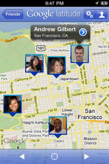
Though we released Latitude as a web application before the iPhone supported third party background applications, today’s Latitude app was built from the ground up using iOS 4’s new multitasking capability to support background updating. You’ll need iOS 4 and above on an iPhone 3GS or iPhone 4 to use the app.
Download Google Latitude now from the App Store in over 15 languages and 45 countries. It will be appearing in the App Store over the next day, but you can also find it directly now. Learn more in the Help Center or ask questions in the Help Forum.
Update (12/13/2010, 10:20am PST): The Google Latitude app will run on the iPhone 3GS, iPhone 4, iPad, and iPod touch (3rd/4th generation). However, background location updating is only supported on the iPhone 3GS, iPhone 4, and iPad 3G. We're continuing to work on expanding support to more devices.
Starting today, you’ll never again have to answer (or ask) that question when you’re on the go with your iPhone. With the new Google Latitude app for iPhone, you can see where your friends are and now, continuously share where you are – even in the background once you’ve closed the app.
Since launching last year, Latitude’s focus has always been on one goal: make it simple to stay in touch with friends and family by sharing where you are with each other. Simple setup. Simple sharing without fumbling for your phone. Now, you can use Latitude on your iPhone just like the more than 9 million people actively using it from Android, BlackBerry, Symbian, and Windows Mobile smartphones. Use the app to:
* See where your friends are
* Share your location continuously with whomever you choose
* Contact friends by phone, text message, or email
* Control your location and privacy
You still get simple control over your privacy. Remember, Latitude is 100% opt-in. You must install the app and add friends (or accept requests) to start sharing your location. You can turn off background updating if you’d like and control the same privacy settings: share only city-level location, hide your location, or sign out of Latitude at any time. Learn more in the privacy tips video.
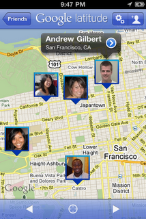
Though we released Latitude as a web application before the iPhone supported third party background applications, today’s Latitude app was built from the ground up using iOS 4’s new multitasking capability to support background updating. You’ll need iOS 4 and above on an iPhone 3GS or iPhone 4 to use the app.
Download Google Latitude now from the App Store in over 15 languages and 45 countries. It will be appearing in the App Store over the next day, but you can also find it directly now. Learn more in the Help Center or ask questions in the Help Forum.
Update (12/13/2010, 10:20am PST): The Google Latitude app will run on the iPhone 3GS, iPhone 4, iPad, and iPod touch (3rd/4th generation). However, background location updating is only supported on the iPhone 3GS, iPhone 4, and iPad 3G. We're continuing to work on expanding support to more devices.
Monday, 13 December 2010
Minneapolis Metrodome Collapses As Blizzard Dumps 20 Inches Of Snow On Midwest
The inflatable roof of the Minnesota Vikings' stadium collapsed Sunday and roads were closed throughout the upper Midwest as a storm that dumped nearly 2 feet of snow in some areas crawled across the region.
A blizzard warning was in effect for parts of eastern Iowa, southeastern Wisconsin, northwestern Illinois, and northern Michigan, according to the National Weather Service. Surrounding areas including Chicago were under winter storm warnings.
The Metrodome's Teflon roof collapsed after Minneapolis got more than 17 inches of snow. No injuries were reported. The snowfall that ended Saturday night was one of the five biggest in Twin Cities history, National Weather Service meteorologist James McQuirter said. Some surrounding communities got more than 21 inches of snow, he said.
Fox News has dramatic video from inside the Metrodome of the roof collapsing.
A blizzard warning was in effect for parts of eastern Iowa, southeastern Wisconsin, northwestern Illinois, and northern Michigan, according to the National Weather Service. Surrounding areas including Chicago were under winter storm warnings.
The Metrodome's Teflon roof collapsed after Minneapolis got more than 17 inches of snow. No injuries were reported. The snowfall that ended Saturday night was one of the five biggest in Twin Cities history, National Weather Service meteorologist James McQuirter said. Some surrounding communities got more than 21 inches of snow, he said.
Fox News has dramatic video from inside the Metrodome of the roof collapsing.
Sunday, 12 December 2010
UK's NHS Launches HealthGIS Maps
The UK’s National Health Service (NHS) AIMTC (Avon Information Management and Technology Consortium) HealthGIS has launched a new intranet mapping service to Primary Care Trust (PCT) clients in Avon, using Cadcorp GeognoSIS and Cadcorp SIS MapModeller. This new service - known as ‘HealthGIS Maps’ - has successfully delivered against its first project milestone, providing Pharmaceutical Needs Assessments for Avon PCTs.
Each PCT in Avon is currently charged with reviewing accessibility to the pharmacy services that it manages. Each Pharmaceutical Needs Assessment requires map-based evidence about access to pharmacies, viewed against demographic and socio-economic indicators. Since PCTs rarely have the necessary expertise in managing geographic information, they are being assisted by a group of GIS experts from the AIMTC HealthGIS team.
The delivery of the Pharmaceutical Needs Assessment maps via HealthGIS Maps marks a significant development in the use of geographic information in the NHS Primary Care sector, as Matthew Leaver, from ‘HealthGIS’ explains.
‘Traditionally all maps have been delivered as PDF or JPEG static media. The deployment of Cadcorp GeognoSIS in HealthGIS Maps means that we can now deliver all content to health care and medicines managers in an easy to use web browser environment. We are confident that this will promote a culture of information dissemination, and lead to efficiency savings through self-service.’
HealthGIS Maps is a service available to all NHS staff with access to the NHS network. It is anticipated that easy access to geographic information, coupled with the ability for end users to create their own bespoke maps, will provide both tangible and intangible cost savings for NHS staff who use geographic information for resource planning, service development and performance monitoring.
HealthGIS plans to achieve further cost savings for their PCT colleagues by using Cadcorp GeognoSIS to enhance legacy IT systems with new geographic capabilities.
‘The government is committed to an evidence-based public health service in the UK,’ noted Mike O’Neil, CEO of Cadcorp, ‘and much of that evidence will be geographically based. Cadcorp is proud to be providing AIMTC HealthGIS with the ability to share that geographic information more widely.’
Each PCT in Avon is currently charged with reviewing accessibility to the pharmacy services that it manages. Each Pharmaceutical Needs Assessment requires map-based evidence about access to pharmacies, viewed against demographic and socio-economic indicators. Since PCTs rarely have the necessary expertise in managing geographic information, they are being assisted by a group of GIS experts from the AIMTC HealthGIS team.
The delivery of the Pharmaceutical Needs Assessment maps via HealthGIS Maps marks a significant development in the use of geographic information in the NHS Primary Care sector, as Matthew Leaver, from ‘HealthGIS’ explains.
‘Traditionally all maps have been delivered as PDF or JPEG static media. The deployment of Cadcorp GeognoSIS in HealthGIS Maps means that we can now deliver all content to health care and medicines managers in an easy to use web browser environment. We are confident that this will promote a culture of information dissemination, and lead to efficiency savings through self-service.’
HealthGIS Maps is a service available to all NHS staff with access to the NHS network. It is anticipated that easy access to geographic information, coupled with the ability for end users to create their own bespoke maps, will provide both tangible and intangible cost savings for NHS staff who use geographic information for resource planning, service development and performance monitoring.
HealthGIS plans to achieve further cost savings for their PCT colleagues by using Cadcorp GeognoSIS to enhance legacy IT systems with new geographic capabilities.
‘The government is committed to an evidence-based public health service in the UK,’ noted Mike O’Neil, CEO of Cadcorp, ‘and much of that evidence will be geographically based. Cadcorp is proud to be providing AIMTC HealthGIS with the ability to share that geographic information more widely.’
Subscribe to:
Posts (Atom)